
If you have ever opened your wardrobe ten minutes before a photo session or just before uploading pictures into an AI headshot generator and thought, "I have nothing to wear," you are not alone. Most people stress about cameras, lenses, and poses, but the quiet decision that affects everything is the color of the clothes that sit closest to your face.
Choose the right color and your eyes look clearer, your skin looks more even, and you come across exactly how you want to be seen at work. Choose the wrong color and you either disappear into the background or the outfit becomes the star of the image while your face takes a back seat.
Because we at ProfileMagic see thousands of professional and AI-enhanced headshots every month, we keep noticing the same pattern again and again: a few simple color choices make almost everyone look more credible, more approachable, and more "put together," while a few loud or extreme color decisions can quietly damage a first impression.
This guide is for you if you want to stop guessing. Instead of "just wear navy" or "avoid red" type advice, you will get a way to think about outfit colors for headshots, with examples that work for both men and women, as well as safe neutral options.
Quick Takeaways
- Mid tone solid colors like navy, charcoal, muted blue, and deep green are safe choices for most professional headshots because they frame the face without overpowering it.
- Neutrals such as grey, navy, beige, and soft stone work well as long as they do not exactly match your background or your skin tone.
- For LinkedIn and other professional platforms, calmer blues and greys usually signal trust and competence better than neon or very loud colors.
- If you have lighter skin, slightly deeper outfit colors often look better; if you have deeper skin, rich jewel tones and golden neutrals usually pop beautifully.
- Solid fabrics and simple layers almost always photograph better than busy stripes, tiny checks, or bold logos near the face.
- AI headshot generators tend to exaggerate very bright or neon colors, so subtle solid tones usually lead to more natural AI professional headshots.
Why Outfit Color Matters In Professional Headshots
When someone looks at your headshot, their brain makes sense of the image in layers. First comes the overall silhouette, then the brightest or most contrasting area, then the eyes. Your outfit color is part of that first impact, and it can either guide the eye up towards your face or pull it sideways towards your chest and shoulders.
The job of your clothes in a headshot is simple but very important. They need to support the face, not compete with it. Strong yet balanced colors around the shoulders and neckline create a visual frame so that your eyes and expression become the main focus. If the color is too similar to your skin or your background, you blend in. If it is too loud or neon, people remember the T shirt, not the person.
There is also a subtle psychological layer. Blues and greys tend to feel calm, steady, and trustworthy. Rich greens and jewel tones can feel confident, modern, and distinctive. Very harsh black or bright red can feel authoritative in some contexts, but they can also feel intimidating or aggressive if combined with the wrong expression or background. So instead of thinking of color as a fashion preference only, it helps to think of it as a quiet signal of how you want to be perceived in your professional world.
Ground Rules Before You Choose Any Color
Before we talk about specific colors for men, women, and neutral outfits, it helps to lock in a few simple rules that remove most of the common mistakes.
Choose Solids Over Busy Patterns
In a headshot, you usually see a small part of your clothes. A pattern that looks tasteful in real life can turn into visual noise when it is cropped tightly around your shoulders. Tiny checks, loud stripes, heavy florals, and big logos create distraction and sometimes even strange moiré patterns on screens. Solid fabrics or very subtle textures almost always look cleaner and more timeless.
Stay In The Middle Of The Brightness Scale
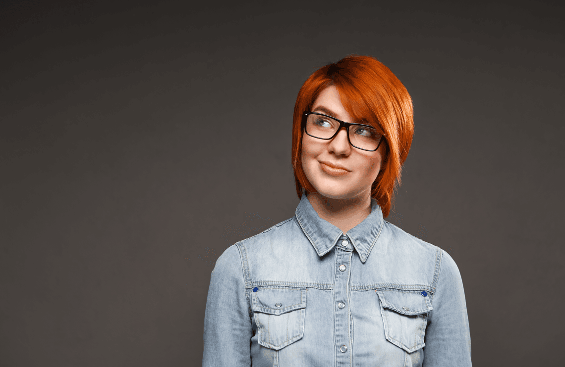
Both pure white and very deep black can be tricky. White can blow out under strong lighting and steal attention away from your face. Solid black can swallow detail, especially if you also have dark hair or a dark background. Mid tone versions of colors, like navy instead of absolute black or soft blue instead of electric blue, keep detail in the fabric and let the camera (or AI) handle the image more gently.
Create Contrast With Background And Skin, Not Conflict
A simple rule that works in most situations is this. If your background is light, go a little deeper with your outfit. If your background is dark, avoid very dark tops that make your shoulders blend into the backdrop. You do not need extreme contrast, you just need enough separation so that your outline is clear and your face sits in the middle of the visual frame.
At the same time, think about your skin tone. If your skin is very light, a very pale top can make you look washed out. If your skin is very deep, a very dark top on a dark background can turn the image into one flat block. Aim for a gentle difference between face, clothes, and background, so each layer is visible without shouting.
Remember That Fit And Neckline Also Matter
Color is powerful, but it works together with fit and neckline. A neat collar, a simple V neck, or a clean crew neck that sits properly around your shoulders will always look more polished than a perfect color on a crumpled or stretched T shirt. For most people, a modest V or U shape that shows a little neck tends to lengthen the line towards the face and feels open and approachable.
Universal Safe Outfit Colors For Professional Headshots
If you want shortcut answers, this is the section you are looking for. These colors work for most people, in most industries, across men and women.
Navy And Deep Blues
Navy is the workhorse color of professional headshots. It feels serious enough for law, finance, and leadership roles, but not so severe that it becomes unfriendly. Navy blazers, shirts, or tops work well against both light and medium backgrounds, and they make eyes and skin tones stand out without looking heavy.
Softer deep blues are also excellent if you want something a little more relaxed than classic navy. They still signal trust and stability but introduce a touch of freshness that works beautifully for tech, consulting, and product roles.
Charcoal And Mid Greys
Charcoal grey sits in that sweet spot between black and lighter grey. It looks refined and neutral, it respects the seriousness of more traditional industries, and it lets your facial features take centre stage. Greys are especially good when you want to appear logical, calm, and understated rather than loud and expressive.
Muted Blues And Teals
Muted blues and teals are perfect when you want something more modern than navy but still firmly professional. These shades look great on camera, photograph well in both natural and studio light, and feel approachable without becoming casual. They are often a good fit for marketing, UX, coaching, and client facing roles where warmth and trust have to live together.
Deep Greens And Earth Tones
Forest green, deep olive, and rich earth tones can be a great way to bring a little personality into your headshot without losing professionalism. They work particularly well for people in sustainability, wellness, creative services, or brands that lean into natural palettes. The key is to keep the tones muted and rich rather than neon or overly bright.
Clean Neutrals
Soft stone, beige, taupe, and cream can look very elegant, especially when layered under a darker blazer or jacket. They should be chosen carefully if you have a very light background or very light skin, but when there is enough contrast, these shades make the overall image feel calm, organised, and high end.
Best Outfit Colors For Men’s Professional Headshots
When men plan outfits for headshots, they often try to copy a generic "blue suit, white shirt" formula. That combination can work, but it is not the only option, and it is not always the best one.
Classic Corporate Roles
If you are in law, finance, senior corporate roles, or any environment where formality still matters, navy or charcoal suits and blazers remain your safest foundation. Pair them with a light blue or soft white shirt and, if you wear ties, choose one that is slightly darker than the shirt but not the main character of the image. Deep blues, muted burgundy, or simple textured ties keep the focus on your face.
Plain black suits are more complicated. They can feel very sharp and powerful, but in a headshot they sometimes read as too stark or even slightly funereal, especially against dark backgrounds. If black is your only suit, consider pairing it with a lighter shirt and making sure your background is not also dark.
Modern Tech And Startup Roles
In tech, startups, and modern product teams, a full suit is often unnecessary and can even feel out of place. In these cases, solid or subtly textured button downs in navy, mid blue, soft grey, or forest green work extremely well. A fine knit crew or V neck in similar colors can also look fantastic, especially when layered over a simple tee.
The idea is to look intentional and put together without looking as if you are dressed for a board meeting that does not match your real day to day environment.
Creative, Design, And Media Roles
If you work in design, media, or more expressive industries, you have more freedom to play with color. Deep jewel tones like emerald, sapphire, or rich burgundy can communicate creativity and confidence while still looking polished. Just keep the rest of the outfit simple. One strong color on a clean, well fitting top usually looks better than several competing colors and patterns.
Colors Men Should Use Carefully
Bright red, very saturated oranges and yellows, and busy micro patterns often do more harm than good in a headshot. They tend to reflect onto the skin, they pull the eye away from your expression, and they can age quickly as trends change. If you love these colors, use them as small accents, not as the main block of color under your face.
Best Outfit Colors For Women’s Professional Headshots
Women have more outfit options, which sounds like an advantage until it becomes decision fatigue. The easiest way to simplify is to think in two layers: the neutral base and the personality color.
Neutrals And Jewel Tones
Neutrals like navy, charcoal, cream, and beige create a stable base that always feels professional. On top of this, jewel tones such as emerald, royal blue, deep raspberry, or rich plum can add presence and energy. A navy blazer with a soft blush or ivory top can feel approachable yet authoritative. A deep green blazer over a cream blouse can feel modern, grounded, and confident.
Blazers, Tops, And Layering Strategy
In a headshot, the area you see most is roughly from mid chest upwards, so your blazer and top do most of the talking. If your blazer is dark (navy, charcoal, black), consider a top that is lighter but not pure white so there is a gentle contrast. If your blazer is lighter (stone, soft grey, muted pastel), pair it with a slightly deeper top to keep your face from blending into the outfit.
Professional With A Soft Edge
Many women want to look professional without losing warmth or softness. Colors like dusty rose, muted lavender, and soft teal can achieve this balance when used thoughtfully. The key is to avoid overly sugary pastels that blend into the skin or look too much like casual daywear. When in doubt, take that color one or two steps deeper so it reads as intentional and grown up on camera.
Patterns, Florals, And Statement Pieces
Florals and prints can work, but they need discipline. If the pattern is high contrast or covers the entire front of your top, it can overpower your face in a tight headshot crop. Statement earrings, bold necklaces, or scarves should not compete with the outfit color and your expression at the same time. Pick one thing to make the statement and let the rest of your look support it.
Neutral Outfit Options That Work Almost Everywhere
Sometimes you do not want to overthink and you simply need a look that will work across LinkedIn, the company website, and maybe even conference speaker bios. This is where neutrals shine.
Black
Black is powerful. It can communicate seriousness, authority, and formality, especially in industries that still value traditional dress codes. The risk is that it can also look flat and a little harsh if lighting is not handled carefully, or if your hair and background are also dark. If you choose black, make sure there is some separation between your shoulders and the background and consider softening it with a lighter shirt or top underneath.
White And Off White
White looks fresh and clean in real life, but in photos it can blow out highlights and overpower the face, especially under strong lighting. Off white, cream, ivory, and very soft beige often solve this problem. They still feel clean and professional, but they keep more detail in the fabric and work better for a wider range of skin tones.
Grey And Navy
If you are stuck, grey and navy are the two colors that will almost never let you down. A well fitting top or blazer in either of these, combined with a simple contrasting inner layer, will look modern today and still look fine a few years from now. They are also the safest base colors for AI headshots because they translate consistently across different lighting and backgrounds.
Match Outfit Color To Skin Tone, Hair, And Background
Color does not exist in a vacuum. The same navy shirt can look completely different on two people with different skin tones and hair colors.
Light, Medium, And Deep Skin Tones
If you have lighter skin, very pale tops in white, pastel pink, or light beige can sometimes make you look washed out, especially on a light background. Slightly deeper colors such as navy, soft teal, muted berry, or mid grey usually bring back dimension.
If your skin tone is medium or olive, you can usually wear both cooler blues and warmer earth tones. Deep greens, teal, rich browns, and muted coral can look particularly balanced, especially if you avoid colors that are exactly the same depth as your skin.
If you have a deeper skin tone, rich jewel tones like emerald, sapphire, royal purple, and deep berry often look amazing. Golden neutrals, camel, and russet can also look beautiful. The main thing to avoid is wearing very dark tops on a very dark background where your outline disappears.
Undertones, Hair, And Eyes
You do not have to become a color analysis expert, but it helps to notice whether you look better in gold or silver jewellery, and whether your skin looks brighter in cooler or warmer shades. People who suit cooler tones tend to shine in blues, cool greys, and purples. People who suit warmer tones often glow in olive, rust, mustard, and warm neutrals.
Hair and eye color can then fine tune the decision. Blue or grey eyes often pop against navy and charcoal. Green or hazel eyes respond well to greens and warm neutrals. Very dark eyes can hold their own next to stronger jewel tones.
The Three Step Headshot Color Playbook
To make all of this easier to use, here is a simple three step playbook that you can apply whether you are going to a studio or uploading photos to an AI headshot generator.
Step One: Decide The Impression You Want To Lead With
Before you touch your wardrobe, choose one primary word that you want your headshot to communicate. It can be approachable, authoritative, creative, or calm. If you want to look approachable, think soft blues, mid greys, and lighter neutrals. If you want to look more authoritative, think navy, charcoal, and deeper jewel tones. If you want to look creative or different, you can choose stronger colors but keep the rest of the outfit simple.
Step Two: Check Your Skin Tone And Background
Now hold that intention next to reality. Think about your skin tone and the background you are most likely to use. Light skin on a light background usually needs a slightly deeper outfit to avoid blending in. Deep skin on a dark background usually needs a slightly lighter or more colorful outfit to create separation. Medium and olive skin can go either way but still benefit from mid tone colors that do not exactly match the background.
The goal is to see clear layers when you squint at the photo in your mind. One layer for background, one for outfit, and one for face.
Step Three: Shortlist Three Outfits And Test On Your Phone
Finally, instead of debating this in your head, put on two or three outfits and take test photos near a window in natural light. Look at those photos as small thumbnails, the way they would appear on LinkedIn or in a messaging app. If your eye jumps to a bright block of color before it reaches your face, that outfit is too loud. If everything melts into one flat tone, you need more contrast.
When we at ProfileMagic test new headshot styles and color combinations, we follow the same process. We choose the impression first, then check contrast with skin and background, then view the results at small sizes because that is how most people will actually see your headshot on screens.
Colors That Confuse AI Headshots And How To Avoid Them
AI headshot generators work with patterns learned from huge numbers of images, and while the technology is impressive, it is still sensitive to extreme inputs. Certain outfit colors and textures tend to give AI more work to do than necessary.
Very bright neon shades, especially in green, yellow, and orange, can end up looking plastic or over saturated in AI generated images. Shiny fabrics with strong reflections and complex tiny patterns can get simplified in strange ways. Large logos or text across the chest can also confuse the model about what is important in the frame.
On the other hand, solid mid tone colors like navy, grey, muted blue, and rich jewel tones tend to translate very well. They keep the focus on the face, they give the model clear structure to work with, and they look natural once the AI professional headshot is rendered.
We at ProfileMagic see this every day when people upload their photos. When users pick solid, balanced colors near the face, the output usually looks more realistic, more polished, and closer to how they want to be perceived. When they choose extremely bright or distracting colors, the AI has to work much harder to keep the image looking human and professional at the same time.
Common Color Mistakes To Avoid
Even if you forget every specific recommendation, try to avoid these very common traps.
- Wearing almost the same color as your background so that your shoulders disappear and only your face floats in the frame.
- Choosing neon or highlighter shades that pull more attention to the fabric than to your eyes and expression.
- Wearing tops with busy stripes, tight checks, or very bold logos that start competing with your facial features.
- Choosing pure white tops under strong lighting, which can make you squint and can wipe out detail in the image.
- Going all black with dark hair on a dark background, where the photo becomes one block of darkness.
- Letting brand colors completely overwhelm the image instead of using them in small accents or layered pieces.
How To Test Your Outfit Color Before The Shoot
You do not need a studio to see whether a color is working for you. A simple three minute test at home will already tell you a lot.
Stand near a window in soft natural light, not in direct sun. Take a close up photo in each outfit option while keeping your posture and facial expression roughly the same. Then look at those images at two sizes. First, full screen, to check that your skin looks even and your eyes are clear. Second, tiny thumbnail size, to see what your brain registers first.
If the first thing you notice at thumbnail size is a block of color, tone it down or go for a more muted shade. If your face and clothes blend into the background so much that you have to squint, increase contrast with a deeper or lighter top. If in doubt between two options, send them to a colleague or friend and ask them which one feels more like "you on your best professional day" rather than "you trying to impress the camera."
FAQs About Outfit Colors For Professional Headshots
1) Is black a good color for professional headshots?
Yes, but with conditions. Black can look powerful and sleek, but it can also look flat or harsh if everything else in the frame is dark. If you choose black, make sure there is some separation between your outfit, your hair, and the background, and soften it with a lighter inner layer if needed.
2) Are white shirts a bad idea?
Not always, but pure white is easily overexposed in strong lighting. Off white, ivory, or cream usually gives a similar clean feeling while keeping more detail and working better with a range of skin tones.
3) Can I wear my company branded T shirt or hoodie?
You can, especially if your brand culture is casual, but it still needs to look intentional and presentable. Make sure the logo is not overwhelming, the fabric is not faded, and the color does not clash with your background. Sometimes pairing company merchandise with a neutral jacket is a good compromise.
4) Is red too aggressive for a LinkedIn headshot?
Bright, highly saturated reds can feel intense, especially in tight crops and on screens. Deeper, richer reds can work well if the rest of your outfit is simple and your expression is friendly. If you are unsure, use red as a smaller accent rather than as the main block of color.
5) What if I need one headshot that works on LinkedIn, my website, and for conference speaker bios?
Then you are almost always safe with navy, charcoal, or mid grey plus a simple contrasting inner layer. These colors look serious enough for formal contexts and relaxed enough for digital profiles. Focus on a genuine expression and good lighting, and your headshot will carry across all those platforms.
Final Thoughts
There is no single magic color that guarantees a perfect professional headshot. What actually matters is how well your outfit color supports the story you want your face to tell, how clearly you stand out from your background, and how comfortable you feel in what you are wearing.
If you stay close to mid tone blues, greys, thoughtful neutrals, and well chosen jewel tones, and if you avoid extreme neons, busy patterns, and complete background matches, you will already be ahead of most people. From there it becomes about fine tuning the impression you want to lead with.
And if you are planning to upgrade your portrait with AI, we at ProfileMagic simply want that choice to feel a little calmer. A considered outfit color, a natural expression, and a few good input photos are often all it takes for your headshot to feel like the most professional and confident version of you, without feeling like a stranger in a borrowed outfit.